Microsoft Strips Copilot's Personality in Major M365 Redesign
Microsoft's AI assistant gets a stark black-and-white makeover, ditching flair for consistency across Microsoft 365.
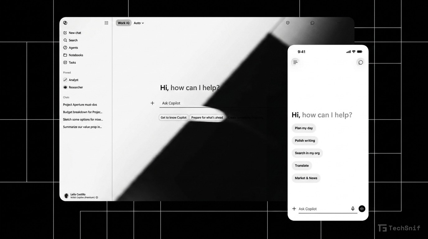
Microsoft just gave Copilot in Microsoft 365 a serious visual overhaul. The AI assistant now sports a minimalist black-and-white, text-heavy interface — and its personality got gutted in the process.
The redesign prioritizes consistency across the Microsoft 365 ecosystem. Gone are the flashier elements. What's left is a stripped-down, utilitarian look that puts text front and center. Think less chatty companion, more productivity tool.
This isn't Copilot's first facelift. Microsoft has been iterating on the assistant's design repeatedly, and this latest swing suggests the company has decided that reliability and uniformity matter more than charm. The new look aligns Copilot's visual language more tightly across Microsoft's suite of apps.
Whether users embrace the austere new aesthetic or miss the old personality remains to be seen. But Microsoft is clearly betting that boring and consistent beats flashy and fragmented.